Context
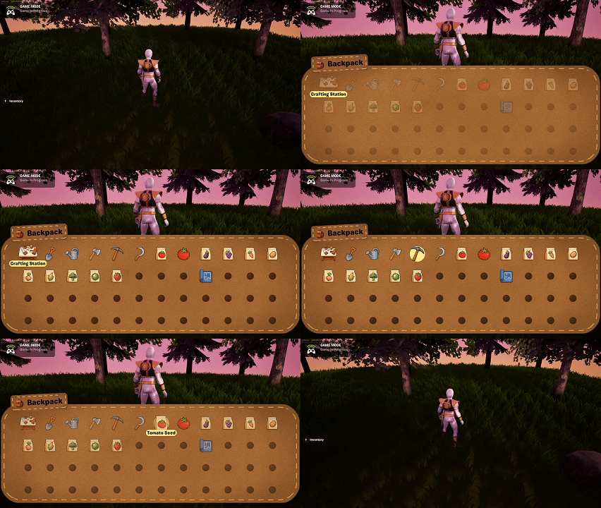
Today was fully focused on UI polish, specifically the Inventory UI. This system has a lot of moving parts—navigation, slot states, item visuals, contextual actions—and I’ve been wanting a stronger visual identity that feels grounded in the world. That led to building a new, flexible UI background material that all future UI can share.
Building a Universal UI Background Material
The goal was to create a material that:
- Resembles suede or canvas (to match a backpack theme)
- Supports rounded corners
- Includes stitched borders
- Can be reused across multiple UI widgets (Inventory, Crafting, Toast, Prompts)
This ended up being a surprisingly complex material. It needed:
- A suede texture with proper tiling
- Parametric rounded‑corner masking
- A dashed‑line generator for stitching
- Edge padding controls so the stitching stays evenly spaced
After a lot of iteration, I now have a highly reusable material that matches the aesthetic I’ve been aiming for.
Inventory UI Progress
With the new material working, I applied it to the Inventory UI. The updated look feels much more cohesive with the crafting UI’s realism‑through‑continuity direction.
The Inventory UI is now mostly complete. A few lingering bugs still need fixing, but functionally it’s in a strong state.

Toast & Prompt Updates
I also upgraded the Toast UI using the new material. More elements will migrate to this system soon so the UI feels visually unified.
Summary
What I accomplished:
- Built a universal suede‑and‑stitch UI material for all background elements.
- Updated the Inventory UI with the new design direction.
- Applied the material to the Toast UI and prepared it for other UIs.
- Got the Inventory UI to a nearly complete state.
What I learned:
- UI cohesion often depends on one or two foundational materials.
- Stitching effects require more math and masking finesse than expected.
- Visual metaphors (“backpack” inventory) help anchor UI design in the game world.


