This was the first real attempt at building the Home_Edit gameplay loop. Most of the day went into architecture rather than visible results.
Cursor Prototype
I prototyped a selector cursor that appears in Home_Edit mode to define placement locations. Right now, it only renders correctly on the ceiling, but the underlying system is partially working.
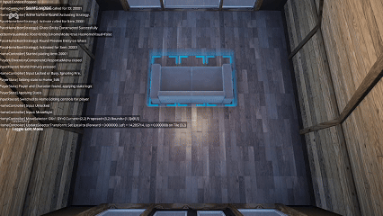
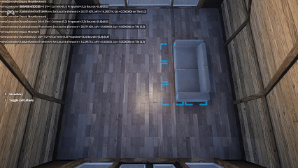
Furniture Placement (Early)
I began experimenting with placing furniture items in the interior space. This is early and imperfect but establishes the placement pipeline.
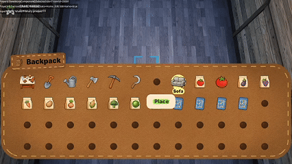
Backpack Experiment
I also generated a backpack mesh in Meshy, reinforcing the idea of using the backpack as a core inventory metaphor later on.
Today pushed the Home system across a major milestone: completing the Starter Home Kit loop from placement to interior access.
Starter Home Flow
Players can now:
Choose where the Starter Home Kit is placed
Wait three in‑game days for construction
Enter the home once it’s built
Interior Transitions
I added a new transition component that fades the screen to black during teleportation between exterior and interior spaces. This dramatically improves UX.
Refactoring & Camera Work
I refactored multi‑tile logic again and added an orbital camera for interior spaces to differentiate the experience from the exterior world.
Summary
What I accomplished:
Completed the Starter Home Kit build flow
Added fade‑to‑black transitions
Refactored multi‑tile placement logic
Added an orbital interior camera
What I learned:
Homes are a forcing function for clean architecture
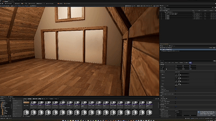
Today I began work on the Home Customization loop—one of the most ambitious systems in Island Crossing. Homes touch placement, persistence, crafting, and world structure, so the foundation needs to be solid.
Home Kit Flow
I started wiring up the progression: Standard Home Kit → Standard Home
Players will place a kit item that eventually expands into a full structure.
Technical Roadblocks
I ran into several blocking issues related to objects larger than one tile. Homes introduce:
Larger footprints
More complex adjacency rules
Stronger coupling between placement and persistence
This exposed weaknesses in the current architecture.
Summary
What I accomplished:
Began the Home Customization system
Imported and tested home assets
Identified architectural limits with multi‑tile objects
Today was another UI‑heavy day focused on polish, bug fixing, and experimenting with new visual styles. With most major systems in place, refining the user experience is becoming increasingly important.
Broad UI Polish
I finished applying polish across the remaining UI elements—everything except the loading screen, which will come much later once more of the game’s flow is finalized.
Notable improvements included:
Updating widget backgrounds to use the new suede‑and‑stitch material
Refining alignments, spacing, and visual consistency
Improving responsiveness across multiple UI layers
Inventory UI Bug Fixes
With yesterday’s big visual overhaul complete, I fixed the last lingering bugs:
Slot selection inconsistencies
Minor layout clipping issues
A submenu state bug related to item actions
The Inventory UI is now stable and feels much more cohesive.
Response Submenu Tweaks
I also refined the Response Submenu to make it more intuitive and faster to navigate. This included adjusting highlight timing, spacing, and button feedback.
Attempting an Animated Thought‑Bubble Material
I spent a large portion of the day trying to create a material that resembled an animated thought bubble—the kind of wiggly, dreamy shapes you might see in cozy or cartoon‑style games.
Unfortunately, despite several approaches (UV distortion, panning masks, procedural shapes), I couldn’t get it readable and clean enough for actual in‑game use. After multiple iterations, I decided to pause the idea.
Sometimes letting go of an experiment is progress too.
Summary
What I accomplished:
Polished nearly all remaining UI (except the loading screen).
Fixed the remaining Inventory UI bugs.
Improved the Response Submenu.
Experimented with an animated thought‑bubble material.
What I learned:
UI polish compounds quickly—small details make a big difference.
Some stylistic experiments don’t pan out, and that’s okay.
The UI foundation is now strong enough to support future features without major rework.
Today was fully focused on UI polish, specifically the Inventory UI. This system has a lot of moving parts—navigation, slot states, item visuals, contextual actions—and I’ve been wanting a stronger visual identity that feels grounded in the world. That led to building a new, flexible UI background material that all future UI can share.
Building a Universal UI Background Material
The goal was to create a material that:
Resembles suede or canvas (to match a backpack theme)
Supports rounded corners
Includes stitched borders
Can be reused across multiple UI widgets (Inventory, Crafting, Toast, Prompts)
This ended up being a surprisingly complex material. It needed:
A suede texture with proper tiling
Parametric rounded‑corner masking
A dashed‑line generator for stitching
Edge padding controls so the stitching stays evenly spaced
After a lot of iteration, I now have a highly reusable material that matches the aesthetic I’ve been aiming for.
Inventory UI Progress
With the new material working, I applied it to the Inventory UI. The updated look feels much more cohesive with the crafting UI’s realism‑through‑continuity direction.
The Inventory UI is now mostly complete. A few lingering bugs still need fixing, but functionally it’s in a strong state.
Toast & Prompt Updates
I also upgraded the Toast UI using the new material. More elements will migrate to this system soon so the UI feels visually unified.
Summary
What I accomplished:
Built a universal suede‑and‑stitch UI material for all background elements.
Updated the Inventory UI with the new design direction.
Applied the material to the Toast UI and prepared it for other UIs.
Got the Inventory UI to a nearly complete state.
What I learned:
UI cohesion often depends on one or two foundational materials.
Stitching effects require more math and masking finesse than expected.
Visual metaphors (“backpack” inventory) help anchor UI design in the game world.
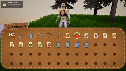
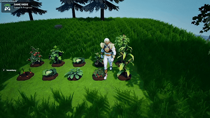
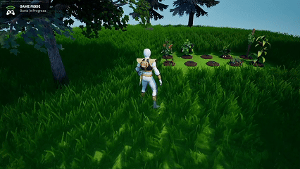
Today was a major milestone for content integration: all remaining crops (ten in total) were imported, set up, and connected to their growth and interaction systems. With this, the core farming catalog is now complete.
Crop Imports & Setup
All remaining crop meshes were:
Imported into the project
Set up with their materials
Configured for the growth‑stage system
Integrated into planting, watering, and harvesting loops
This completes the foundation for farming variety.
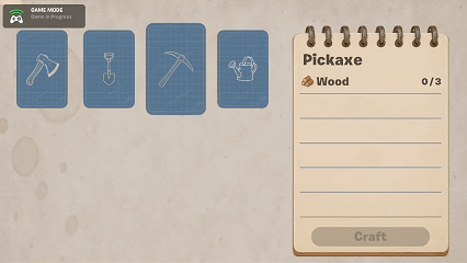
Crafting UI Polish
The Crafting UI is now essentially feature‑complete. It reflects the crafting station visually and carries a sense of continuity between the world and the interface.
Inventory UI Direction
The Inventory UI still needs more work. I’m exploring the idea of giving it a “backpack” motif to match the goal of realism‑through‑continuity.
It’s trickier to execute cleanly because:
Inventory has more interactive states
The visual metaphor must remain readable
Slot highlighting and navigation need to feel natural
But I’m moving in a good direction.
Remaining UI Elements
Two pieces still need attention:
Interaction Prompt UI redesign
Toast Notifications polish
I also want more fluid transitions across all UIs once the structure is fully locked in.
Memory Budget Progress
All crop imports and textures put the project at 14% total size, which is exactly where I hoped to land at this stage. Staying under 15% is a huge win, considering how much content has been added.
Summary
What I accomplished:
Imported and configured the final batch of ten crops.
Brought the Crafting UI to near‑final form.
Established a design direction for the Inventory UI.
Maintained project size under the 15% target.
What I learned:
UI cohesion matters just as much as functionality.
Content-heavy updates require strict texture and asset discipline.
Hitting memory targets early helps prevent stressful late‑stage optimization.
Today I made real progress on the day/night cycle and continued tightening up the project’s memory usage. While the custom skybox approach has been challenging, I finally landed on a hybrid solution that balances flexibility with visual quality.
Day Sequence Devices + Level Sequence
I decided to move forward with a system that blends Day Sequence Devices with a Level Sequence to control sky transitions. It’s not perfect, but it works reliably enough to move on.
Current setup includes four distinct time‑of‑day states:
12 AM (Midnight)
6 AM (Morning)
12 PM (Noon)
6 PM (Evening)
These switch immediately at the correct times and work alongside my custom sky sphere to achieve a stylized look. It’s functional and visually cohesive, even if not fully dynamic.
Memory Budget Work
I continued optimizing the project:
Removed unused assets
Compressed textures
Standardized more materials
This reduced the project size from 15% down to 12%, which puts me in a safer range before importing the rest of the crops.
My goal remains: stay under 15% total usage once everything is brought in.
UI Polish Coming Soon
With the sky system stabilized and optimization underway, I’ll soon return to UI polish—particularly the inventory, crafting, and interaction prompts.
Summary
What I accomplished:
Finalized the day/night cycle using Day Sequence Devices + Level Sequence.
Integrated four distinct times of day into world logic.
Reduced project size from 15% to 12% via cleanup and compression.
Maintained stylized sky visuals using the custom sky sphere.
What I learned:
A pragmatic solution is sometimes more valuable than a perfect one.
Texture compression has an outsized effect on overall memory.
Hybrid sky systems can deliver solid results without full dynamic lighting control.